WalkMe alternatives are not one category. They are three different buying decisions wearing the same label.
That is why so many teams make a bad pick. They search for a cheaper WalkMe, then end up buying the wrong class of product. Some need a lightweight onboarding tool they can launch this week. Some need a product adoption platform with analytics and feedback. Some need a tightly controlled enterprise DAP for internal rollouts, compliance, and cross-app governance.
WalkMe sits at the heavy end of the market, and the pricing across competitors makes the split obvious. You are not choosing between near-identical tools. You are choosing between very different jobs, very different deployment models, and very different levels of organizational complexity.
The filter that works is the job-to-be-done. Call it the JTBD Spectrum. On one end are fast, lightweight tools built for tours, checklists, and in-app prompts. In the middle are product adoption platforms that combine guidance, analytics, and feedback loops. On the far end are enterprise DAPs built for governance, training, compliance, and large-scale transformation. (If the core question is really just StepsKit versus WalkMe, the direct StepsKit vs WalkMe comparison covers that head-to-head.)
One thing to know before reading the table: only half of these tools publish a real price. StepsKit, Userpilot, UserGuiding, Product Fruits, and Pendo's free tier show numbers. Whatfix, Appcues, Chameleon, Stonly, and Gainsight PX are quote-only — you can't compare them without a sales call. That gap matters as much as any feature.
Quick comparison: best WalkMe alternatives
| Product | Core / Unique features (✨) | UX quality (★) | Pricing & value (💰) | Target audience (👥) |
|---|---|---|---|---|
| 🏆 StepsKit | ✨ No-code visual builder, AI content assistant, instant no-deploy updates, smart targeting & frequency caps | ★★★★★ | 💰 Flat $19/mo Pro, unlimited tours/users, 1st tour free | 👥 Product, Growth & CS teams; SMBs & startups |
| Whatfix | ✨ Enterprise DAP + Mirror simulations, product analytics & governance | ★★★★☆ | 💰 Custom / quote-based | 👥 Large enterprises, complex rollouts |
| Appcues | ✨ In-product visual builder, templates & best-practice patterns | ★★★★☆ | 💰 Quote-based (MAU-metered); no public pricing | 👥 PLG product & growth teams |
| Pendo | ✨ Deep product analytics + in-app guides, NPS surveys | ★★★★☆ | 💰 Free up to 500 MAU; paid tiers quote-based | 👥 Teams needing analytics + in-app messaging |
| Chameleon | ✨ Highly styled native-feeling tours, deep integrations | ★★★★☆ | 💰 MTU-based; entry price not published | 👥 Design-focused PLG teams, growth stacks |
| Userpilot | ✨ No-code growth flows, built-in surveys & NPS, integrations | ★★★★☆ | 💰 From $299/mo (≤2k MAU, billed annually) | 👥 Mid-market SaaS teams |
| UserGuiding | ✨ Code-free tours, hotspots, checklists & resource center | ★★★☆☆ | 💰 Free tier; Starter $174/mo (billed yearly, MAU) | 👥 Lean teams and SMBs |
| Product Fruits | ✨ Adaptive onboarding, checklists, hints, surveys, life ring | ★★★★☆ | 💰 From $96/mo (MAU, billed annually); free trial | 👥 Startups & SMBs seeking essentials |
| Stonly | ✨ Interactive guides + knowledge base for self-serve support | ★★★★☆ | 💰 Quote-based; small tier capped at 4k guide views/mo | 👥 Support & customer success teams |
| Gainsight PX | ✨ Enterprise PX: engagements + deep analytics & audience mgmt | ★★★★☆ | 💰 Custom / quote-based | 👥 Large enterprises, CS-aligned organizations |
1. StepsKit: Best for shipping in-app tours fast without engineering
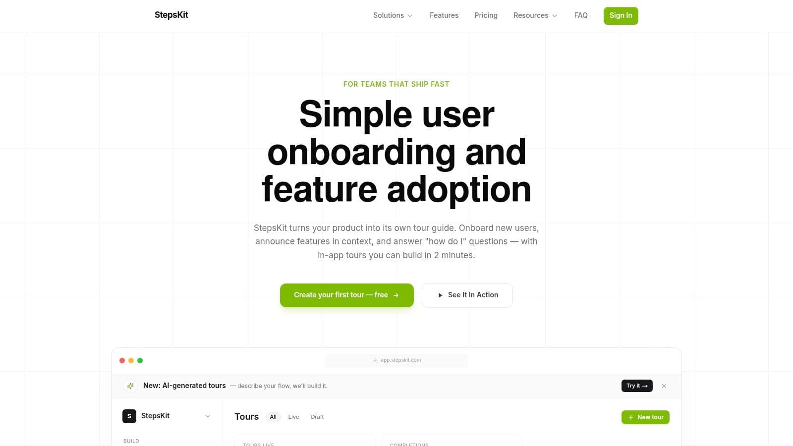
If the real job is shipping in-app guidance without dragging engineering into every edit, StepsKit sits at the fast-execution end of the spectrum. It's web-first and unapologetically focused: install a script, open the visual builder, and publish user onboarding flows, tooltips, and popovers directly on top of your product. The team that owns onboarding ships onboarding — product, growth, and support don't wait in the dev queue to change a tooltip. The constraint is the point; it's not trying to be a sprawling enterprise DAP.
What StepsKit does well
- Anchor guidance to real UI elements, then target by plan, role, URL, or custom attributes — relevance beats volume
- Frequency caps and page-level rules so you stop showing everyone the same generic tour
- Built-in templates, smart placeholders, and an AI content assistant that takes non-writers from blank page to usable draft
- Flat pricing that doesn't punish success — building more guidance never raises the bill
- A practical test it passes: a non-technical PM can update onboarding in one sitting
Where it falls short
- Web-first only — no deep enterprise governance or procurement-friendly control layers
- Not built for a broad internal training stack across many business systems
- Lighter analytics than a dedicated product-analytics suite
Pricing: Flat $19/mo Pro — unlimited tours and users, first tour free. No per-MAU metering. (pricing)
Best for: Growth-stage SaaS teams that want contextual tours and feature adoption live fast, without engineering or enterprise overhead.
The tradeoff: You give up enterprise governance and deep analytics for speed and predictable cost. For most growth-stage teams, narrow beats bloated. (See the StepsKit vs WalkMe comparison for the direct head-to-head.)
2. Whatfix: Best for enterprise change management at scale
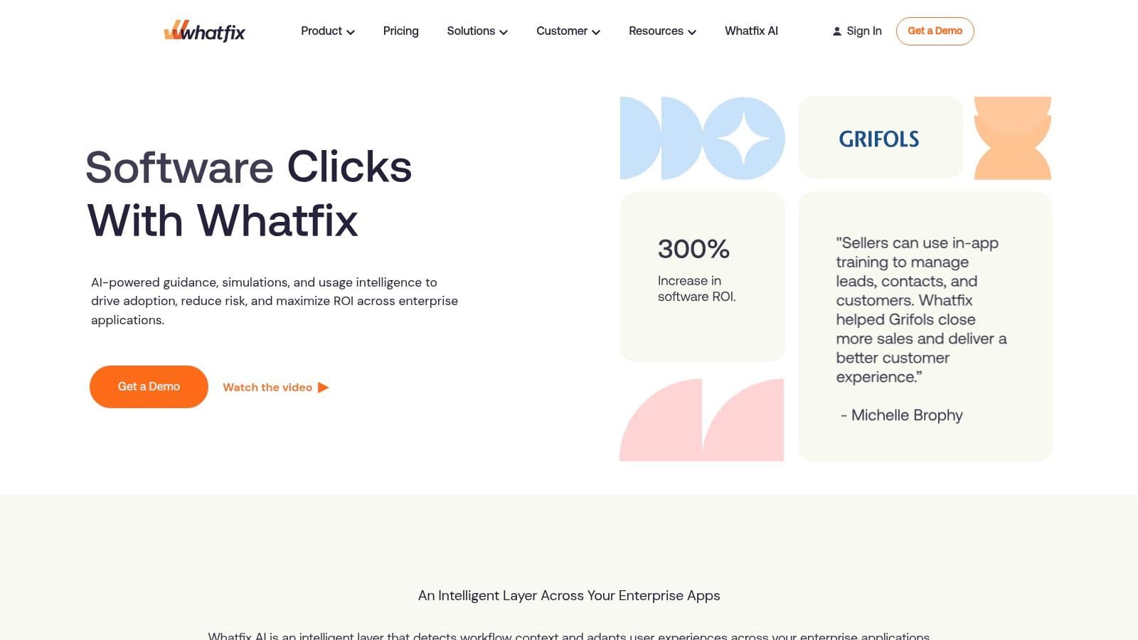
Whatfix sits close to WalkMe on the spectrum because both are built for high-governance environments. You reach for it when the problem is bigger than a welcome tour — guided workflows across CRM, ERP, HCM, and other internal systems, with controls around who publishes what, where it appears, and how adoption is measured across departments. A startup improving activation in a single SaaS product is shopping in the wrong aisle; a large company rolling out process change across business systems is in exactly the right one.
What Whatfix does well
- Contextual guidance, self-help content, and admin control built for enterprise operations
- Product Analytics to spot adoption gaps and friction across the stack
- Mirror simulated-training environments — disciplined practice instead of teaching employees inside live systems
- Governance and cross-application deployment that lighter tools can't match
Where it falls short
- Heavy: more stakeholders, more setup, more internal process before anything ships
- Overkill for customer activation inside one app
- Not a tool you hand to a scrappy PM who needs onboarding live this week
Pricing: Custom / quote-based, enterprise pricing. No public figures.
Best for: Large organizations whose real job is enterprise transformation, internal software adoption, or governed change rollout.
The tradeoff: You buy governance, scale, and simulation — and pay for it in time, cost, and coordination. The right trade when security reviews and cross-app rollout are real; the wrong one if you just want faster experiments.
3. Appcues: Best for fast customer onboarding without dev bottlenecks
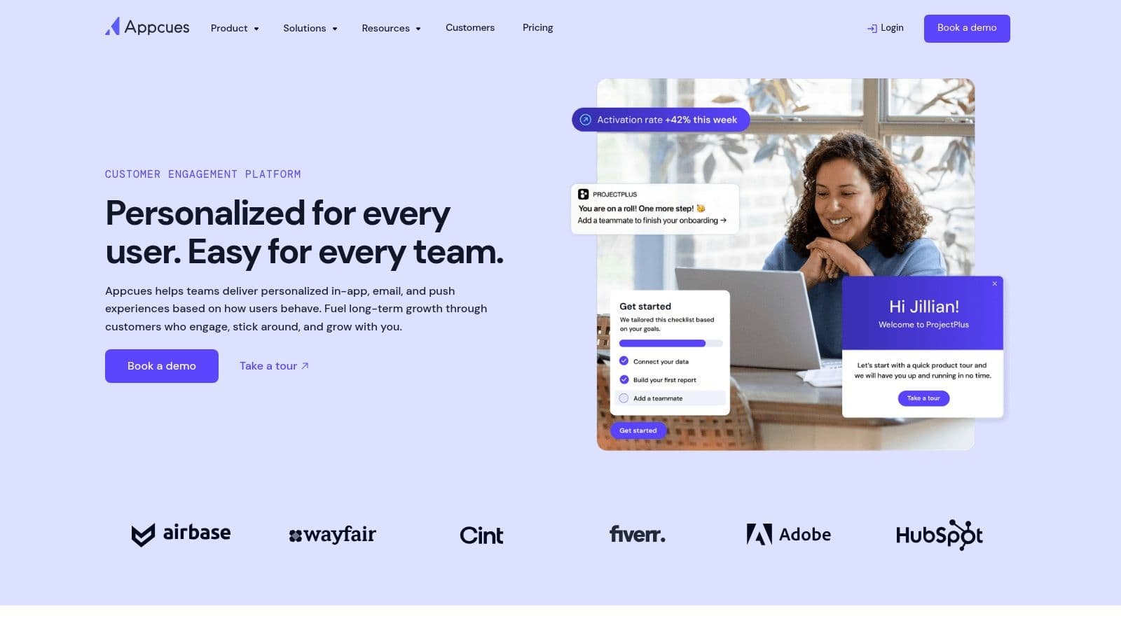
Appcues sits in the customer-activation zone: built for SaaS teams improving first-run experience, feature discovery, and in-app nudges inside their own product. It is not trying to run enterprise change management across a messy stack of internal tools — it helps you ship customer-facing onboarding without engineering bottlenecks. That focus shows up in a builder that pushes teams toward familiar patterns (flows, pins, banners, surveys, checklists) instead of inviting them to overdesign every interaction.
What Appcues does well
- The most polished no-code builder in the category, with a gentle learning curve
- Templates and pre-built patterns that reduce thrash and get something respectable live fast
- Mature segmentation and event-based targeting
- A strong opinion about what good onboarding looks like — a benefit, not a constraint
Where it falls short
- No public pricing — every tier is "book a call"
- Narrow once the job becomes deep behavior analysis, cross-product reporting, or broad governance
- Likely more than a tiny team that only needs a basic tour should pay for
Pricing: Quote-based, metered on MAUs and installations (Start ≤3k MAU, Grow ≤50k MAU, Enterprise custom). A Spark program exists for teams under 25 people. No public figures.
Best for: PLG product and growth teams whose main job is customer onboarding inside one product and who want to ship this month. If analytics is the priority, weigh Pendo alternatives for in-app adoption first — and if the quote-only pricing gives you pause, there's a full comparison of the best Appcues alternatives.
The tradeoff: Faster execution and a friendlier setup, in exchange for pricing opacity and analytics depth that lives somewhere else.
4. Pendo: Best for analytics-first product teams
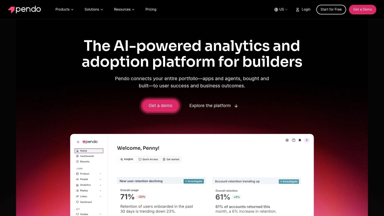
A lot of teams say they want onboarding software when what they want is product analytics with a guidance layer attached. Pendo fits that reality better than tools built mainly for tours and checklists. You get analytics, feedback collection, surveys, and in-app guides in one product, which is why it keeps showing up in larger PLG and post-sale adoption stacks. The real reason to buy is operational clarity: product, growth, and customer teams working from one system instead of arguing across separate analytics, survey, and messaging tools.
What Pendo does well
- The deepest product analytics of this group, plus session replay on higher tiers
- In-app guides, NPS, and feedback in the same platform as the data
- A shared source of truth across teams once multiple groups touch adoption
- A genuine free tier (up to 500 MAUs) to start
Where it falls short
- Expensive in two ways: the invoice, and the operating discipline it demands
- Wasted spend if you treat guides as the main event, or never build the habit of acting on the data
- Heavier than necessary for a team whose job is support deflection or faster onboarding launches
Pricing: Free up to 500 MAUs; paid tiers (Base, Core, Ultimate) are quote-based, priced on MAUs plus chosen functionality.
Best for: Teams whose core job is measurement first, guidance second, and who already have (or are ready to build) product-ops muscle.
The tradeoff: Unmatched analytics depth in exchange for cost and setup. For simpler in-app adoption, compare a few alternatives to Pendo before committing.
5. Chameleon: Best for design-controlled, native-feeling guidance
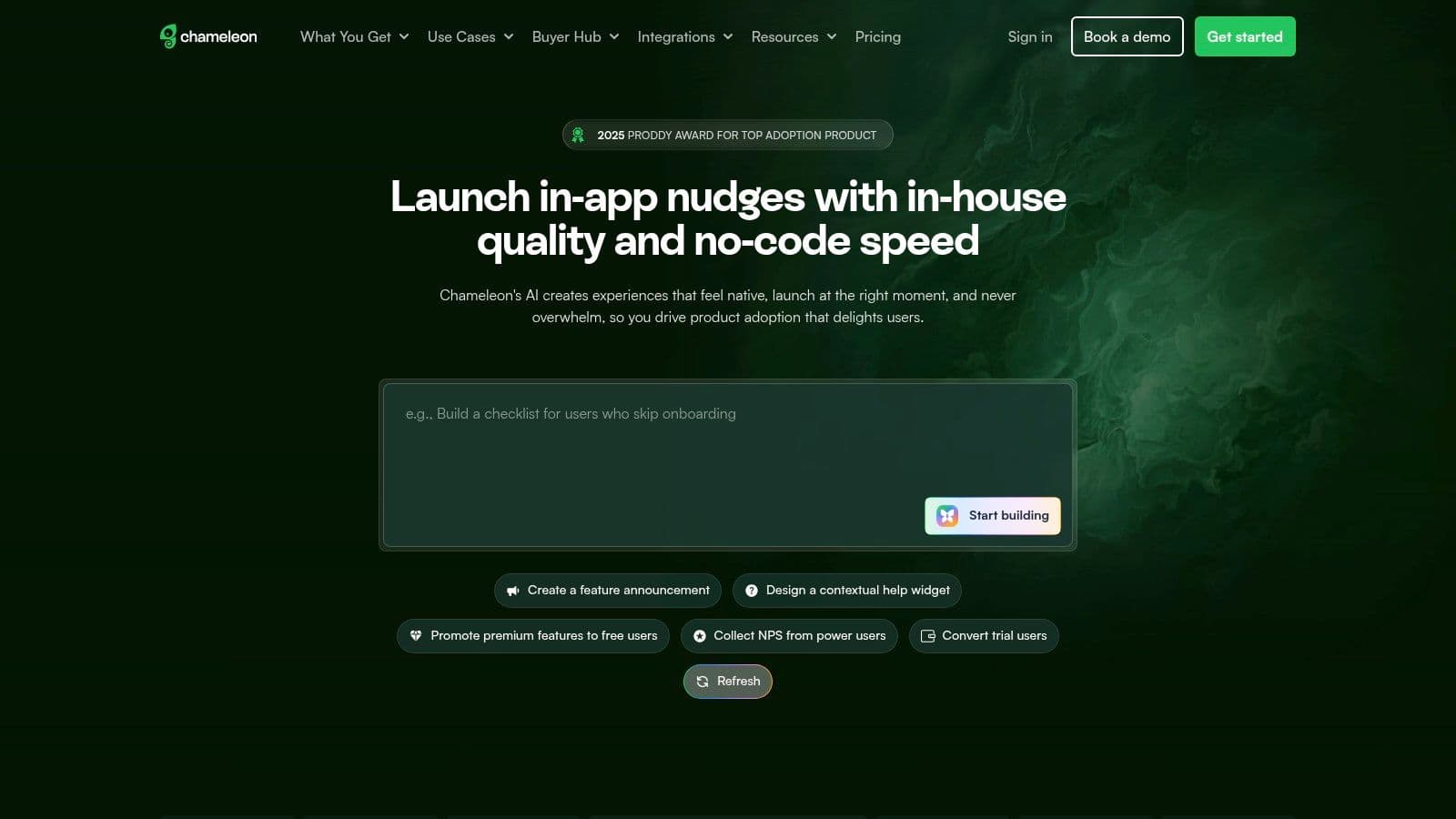
Chameleon is for teams that care a lot about how guidance looks inside the product. A lot of user guidance fails because it screams "marketing overlay" and users dismiss it before reading a word. Chameleon's value is letting teams build experiences — tours, tooltips, launchers, checklists, microsurveys — that blend into native UI rather than interrupt. Launchers are a good example: a subtle help menu users open when they need it, instead of a forced full-screen flow.
What Chameleon does well
- Deep styling control for guidance that feels native, not bolted on
- Launchers and on-demand patterns suited to repeat users who hate interruptions
- Strong integration depth for product-led growth stacks (targeting and data sync)
- A genuine fit when design quality is a real requirement
Where it falls short
- More flexibility means more setup and more room to overcomplicate
- Not the first pick for a tiny team that wants a tour live by tomorrow
- Entry pricing is no longer published, so comparison needs a sales touch
Pricing: MTU-based (scales with monthly tracked users). Startup tier offers a free trial, but the exact entry price isn't published; Growth and Enterprise are quote-based.
Best for: Design-focused PLG teams where product and growth work closely and in-app polish matters.
The tradeoff: Design control in exchange for setup effort. Many teams that say they want "native-feeling onboarding" really just want clean defaults — only some need this much flexibility. For the full picture, see our Chameleon alternatives breakdown, or the full StepsKit vs Chameleon comparison for the head-to-head.
6. Userpilot: Best for mid-market activation and feedback in one tool
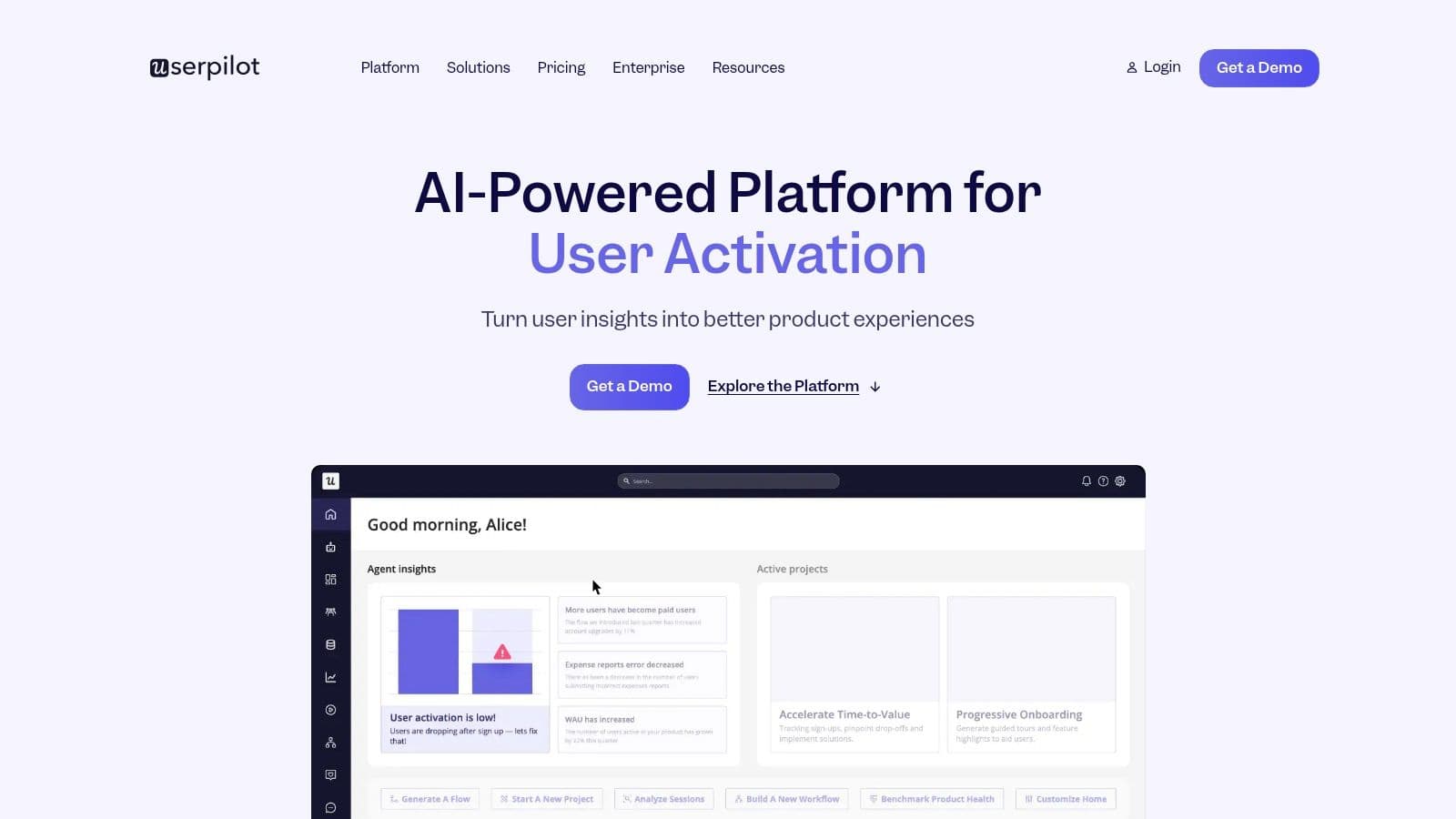
Userpilot fits SaaS companies that have outgrown basic onboarding tools but are nowhere near a full digital adoption program. That middle ground is bigger than vendors admit: teams that don't need enterprise change management and a long implementation cycle, but do need to onboard faster, trigger guidance from behavior, collect feedback in-app, and give product and growth one place to manage activation. The core value is combination, not novelty — activation usually breaks at the handoff points between separate tools.
What Userpilot does well
- In-app flows, checklists, tooltips, surveys, NPS, segmentation, and event-based targeting in one product
- Lets product marketers launch guidance without waiting on engineering for every change
- Enough targeting and usage data to avoid blind broadcasting
- A product bias toward contextual onboarding over static tours
Where it falls short
- Not built for deep enterprise governance or heavy-duty analytics
- Not a replacement for a dedicated analytics stack when analysis is the primary reason to buy
- MAU metering means cost climbs with growth
Pricing: Starter from $299/mo (billed annually, up to 2,000 MAUs); Growth and Enterprise are quote-based.
Best for: Mid-stage B2B SaaS teams that need segmentation, experimentation, and feedback loops — without the budget or complexity of a WalkMe-style rollout.
The tradeoff: One tool covering a lot of day-to-day activation work, at the cost of best-in-class depth in any single area.
7. UserGuiding: Best for lean teams that need onboarding live now
UserGuiding fits early-stage and lower-mid-market SaaS companies whose job is simple: reduce confusion, guide setup, announce changes, and give users a self-serve place to get unstuck. That's a real job, and it doesn't require WalkMe-level process overhead. The product keeps scope tight, and a smaller tool forces clearer decisions — teams stop pretending they're buying enterprise transformation software when the actual problem is that new users never finish setup.
What UserGuiding does well
- Walkthroughs, hotspots, checklists, in-app messages, and a resource center that cover most lean-team onboarding needs
- Fast to publish — strong for cutting down repeat "where do I click" support tickets
- A genuine free "Support Essentials" tier for self-serve help-center features
- Transparent, published entry pricing
Where it falls short
- Lighter on analytics depth, governance, and enterprise control
- Not the answer for cross-application employee training or strict admin structures
- Per-MAU metering still climbs as you grow
Pricing: Free "Support Essentials" tier; Starter $174/mo (billed yearly, MAU-metered); Enterprise quote-based.
Best for: Startups and lean SaaS teams that need users to value faster without pulling engineers into every onboarding edit. (See the StepsKit vs UserGuiding comparison for the full pricing and feature detail.)
The tradeoff: Speed and a friendly price in exchange for depth — little is missing, little is exceptional. The right call when budget and speed matter more than governance.
8. Product Fruits: Best budget option for essential guidance
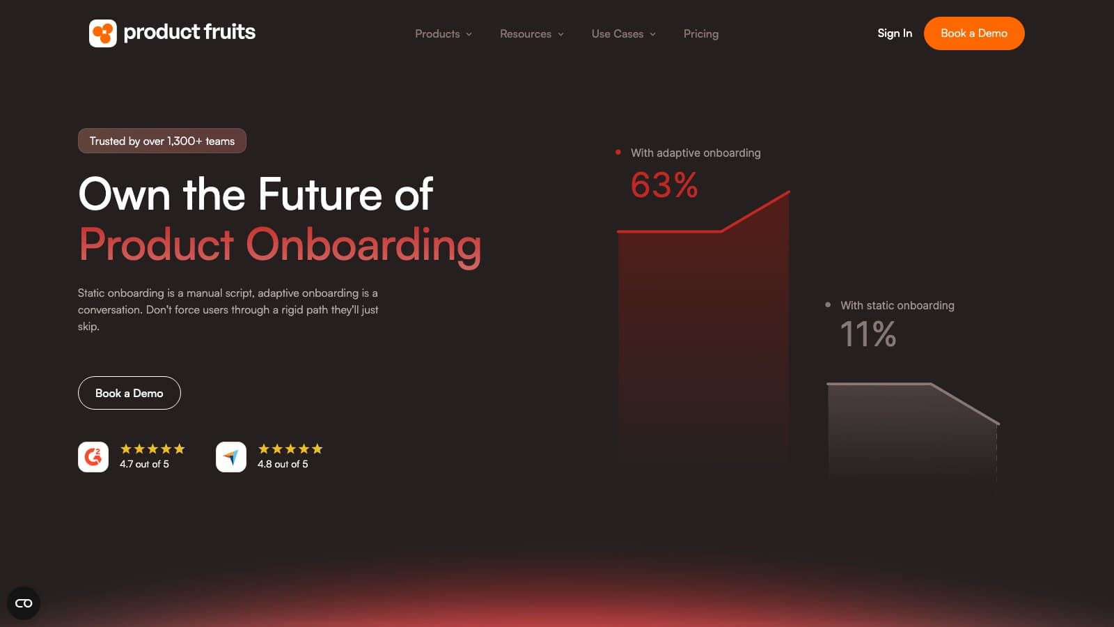
Product Fruits is for teams that want the essentials without enterprise overhead — onboarding, checklists, hints, surveys, and a help-center "life ring," with a free trial and no sales call to get started. It covers the classic entry-level patterns well, plus adaptive onboarding that adjusts to the user rather than forcing everyone down the same rigid path. For a startup whose support queue keeps filling with the same navigational questions, that's enough to make a real dent.
What Product Fruits does well
- All-in-one essentials: tours, checklists, hints/beacons, surveys/NPS, announcements, and a resource center
- Adaptive onboarding that responds to user behavior instead of a single linear flow
- Self-serve and budget-friendly — free trial, no credit card, published pricing
- Strong satisfaction ratings (G2 4.7) for a tool in this price band
Where it falls short
- Not built for complex multi-app rollouts or enterprise governance
- Analytics are lighter than an analytics-first platform
- MAU metering means cost grows with reach
Pricing: Starter from $96/mo (billed annually, MAU-metered); free trial with no credit card; Pro and Business tiers above that.
Best for: Startups and SMBs that want straightforward in-app guidance for a web app and care about budget.
The tradeoff: Essentials done well and cheaply, in exchange for the depth and governance a heavier platform provides. A startup usually learns more from a simple system it iterates on than a premium one it barely configures.
9. Stonly: Best for support deflection via interactive guides
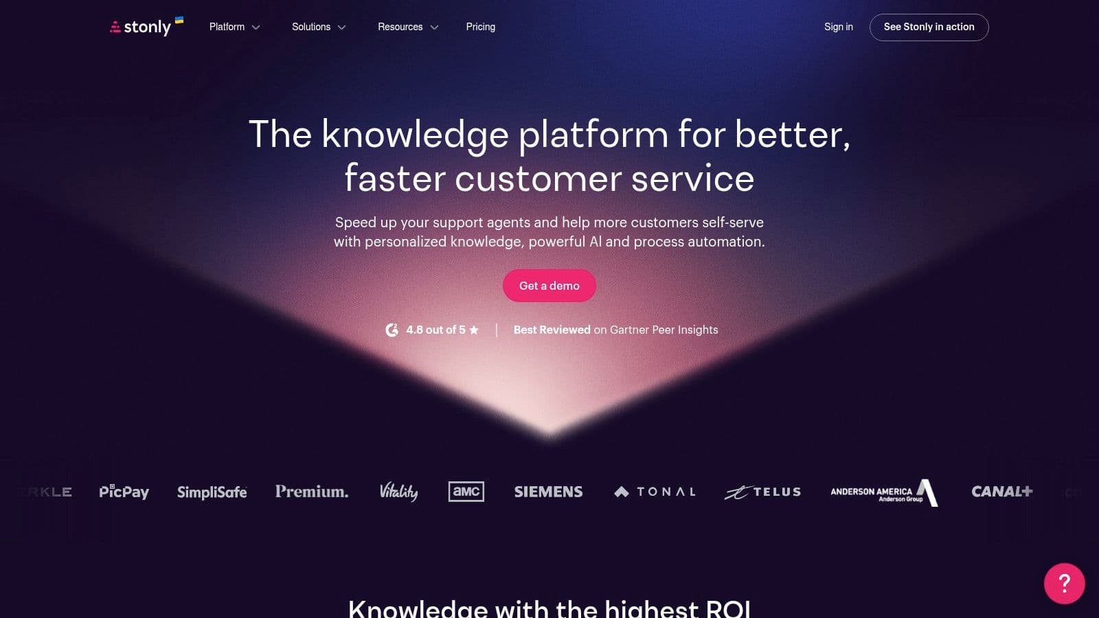
Stonly is the tool to reach for when the problem isn't onboarding flow design — it's support load. A lot of teams search for WalkMe alternatives when what they actually need is better self-serve help. Stonly combines interactive step-by-step guides with a knowledge base, which changes the shape of the solution: instead of pushing users through everything proactively, you embed help where people ask for it and keep content consistent across surfaces.
What Stonly does well
- Interactive, branching guides that beat static docs when a workflow has decision points
- One content system that powers in-app help, the docs site, and support channels
- A strong fit for self-serve support and recurring "how do I do X?" questions
- Knowledge-base plus guidance in a single tool
Where it falls short
- Not a full product-analytics tool — limited behavioral visibility
- Quote-based pricing with view caps on smaller tiers
- Aimed at support/CS, not product-team activation
Pricing: Quote-based. The Small Business tier is capped at 4,000 guide views/month; Enterprise is custom. No public entry price.
Best for: Support and customer success teams whose root issue is user confusion and repetitive tickets, not feature discovery.
The tradeoff: Better guided documentation and deflection in exchange for product analytics. Some adoption problems are really documentation problems wearing an onboarding costume.
10. Gainsight PX: Best for CS-aligned product analytics
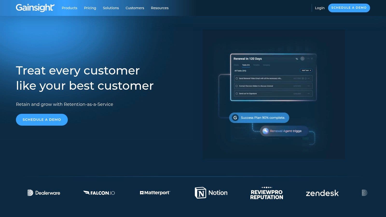
Gainsight PX makes the most sense when product usage data, audience segmentation, and customer success workflows are all part of the same operational picture. A lot of onboarding platforms live mostly in product or growth; Gainsight PX is built to connect in-product behavior with account-level action. It combines in-app engagements — tours, tooltips, surveys — with analytics and event tracking, so teams can define audiences, watch behavior, and act on it without bolting separate systems together.
What Gainsight PX does well
- In-app engagements plus analytics and event tracking in one platform
- Fits a broader account and lifecycle model — expansion, health scoring, account management
- Useful for feature adoption tied to usage insight
- Strong when customer success is a real operating function, not an afterthought
Where it falls short
- Usually too much for early-stage teams
- Heavier implementation and maintenance burden than lighter onboarding tools
- Value only shows up with mature product and success operations
Pricing: Custom / quote-based, enterprise-focused. No public figures.
Best for: Large, CS-aligned organizations that want product analytics and in-app engagement connected to customer success operations.
The tradeoff: Account-aligned sophistication in exchange for cost and complexity. If success ops aren't mature yet, you'll pay for capability you won't use.
How to choose the right WalkMe alternative
Skip the feature checklist. Start with the job you're hiring the tool to do right now, then shortlist from there:
- Support deflection is the pain → Stonly for guide-first self-serve, or StepsKit for in-app tooltips.
- Fast customer onboarding and activation → StepsKit, Appcues, or UserGuiding — choose on how much polish and segmentation you need.
- Analytics and guidance in one tool → Pendo (deepest) or Userpilot (mid-market).
- Design control and native feel → Chameleon.
- Tight budget → Product Fruits, UserGuiding's free tier, or StepsKit's flat $19.
- Enterprise change management and governance → Whatfix (or WalkMe-class DAPs).
- Customer success owns adoption → Gainsight PX.
Two filters decide more than ratings do. First, pricing transparency: half this list is quote-only, so a sales call is the real cost of entry for Whatfix, Appcues, Chameleon, Stonly, and Gainsight PX. Second, implementation burden: the heavier the tool, the more team, process, and patience it needs before it affects a single user.
The right tool is the one you'll actually use
Teams buy for the demo, not for the job. A big WalkMe replacement looks convincing in a sales call — then someone has to map journeys, build flows, maintain targeting, review copy, and keep it current as the product changes. In a lot of companies nobody owns that work for long, and expensive software sits half-built while onboarding, activation, and support issues stay exactly where they were.
That's why the lighter product often wins: it ships, gets iterated, and starts changing user behavior while the bigger platform is still in setup. Adoption matters far more than theoretical capability — the best platform on paper loses if your team can't keep it live, relevant, and measured.
If the job-to-be-done is targeted in-app tours, tooltips, and popovers inside a web product, without turning the project into an enterprise implementation exercise, StepsKit is built for exactly that: ship contextual guidance fast, target it cleanly, and iterate without waiting on engineering. For the broader category beyond WalkMe's direct competitors, see the best product tour software in 2026.